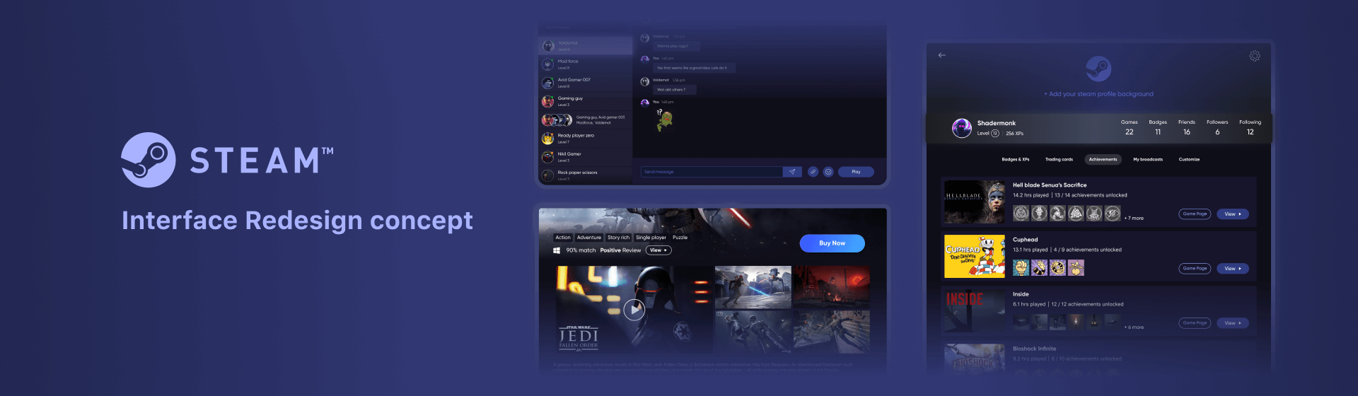
Steam UI Re-Design

UX Design | Visual Design

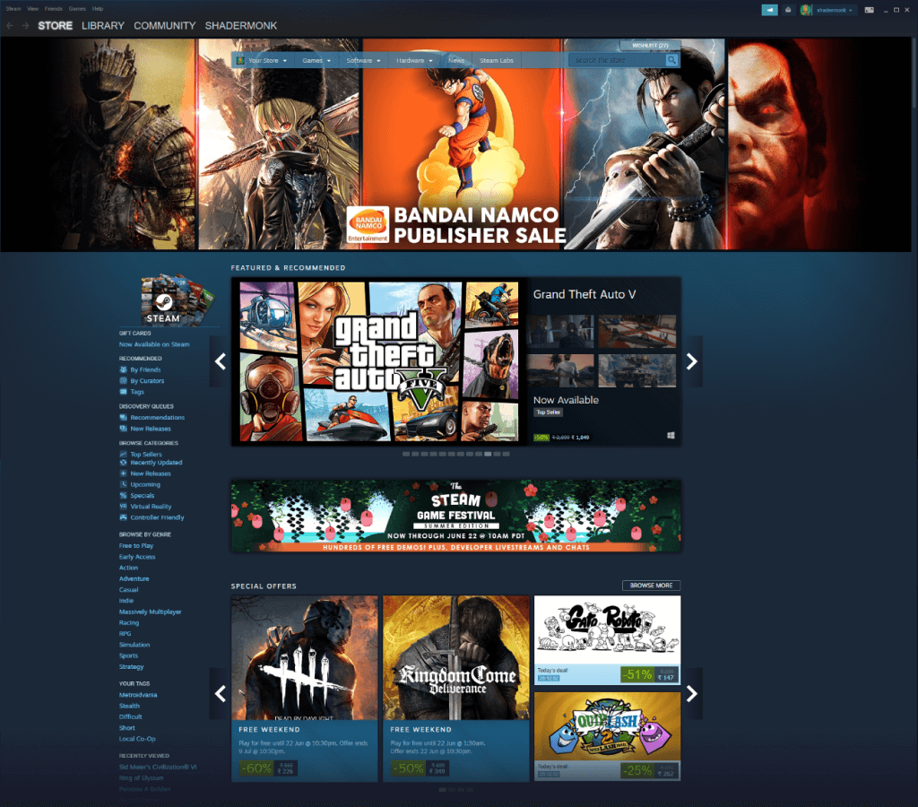
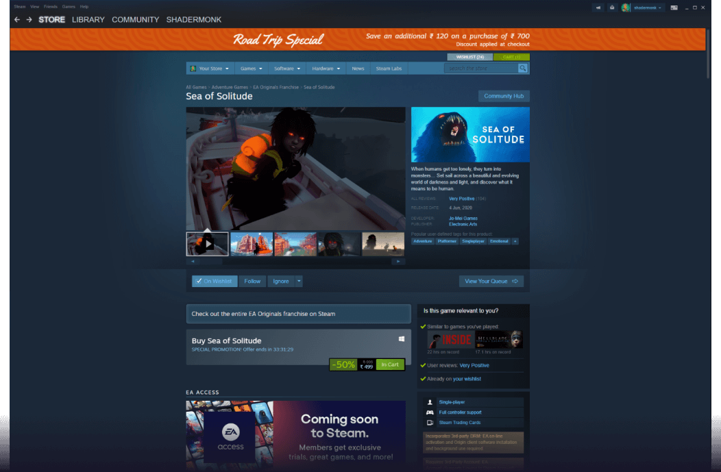
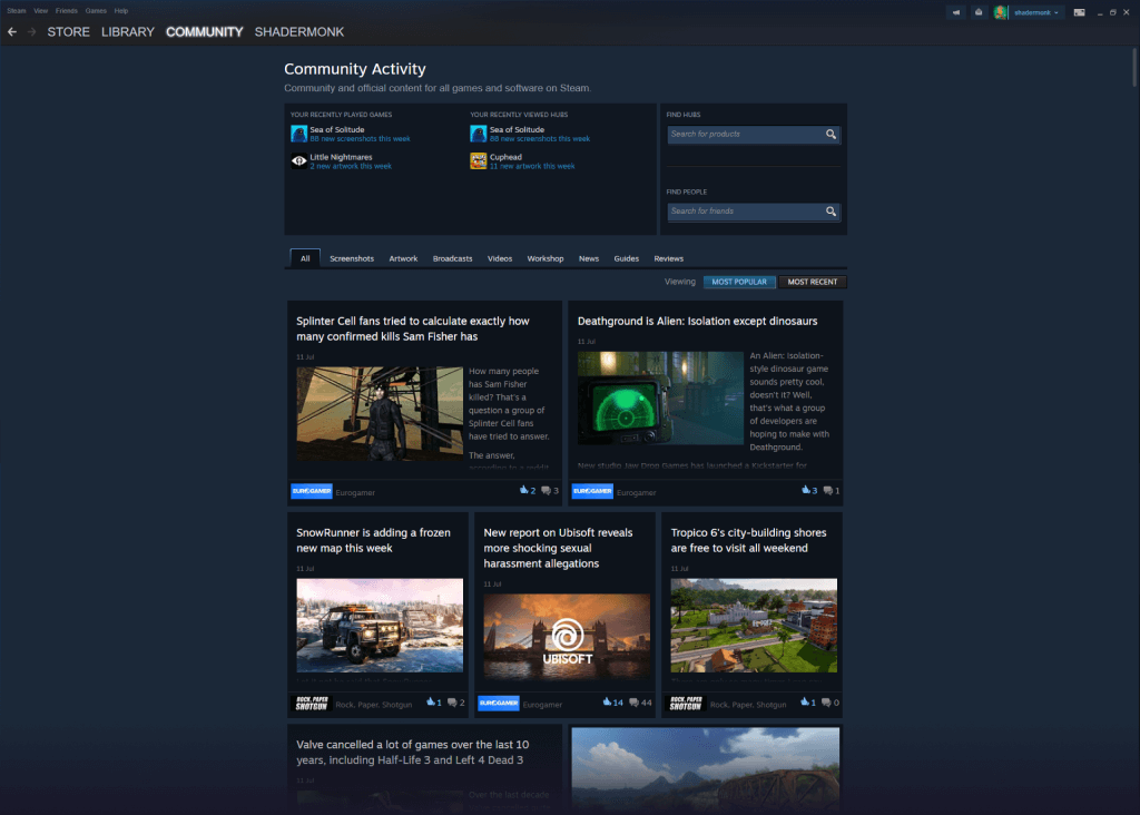
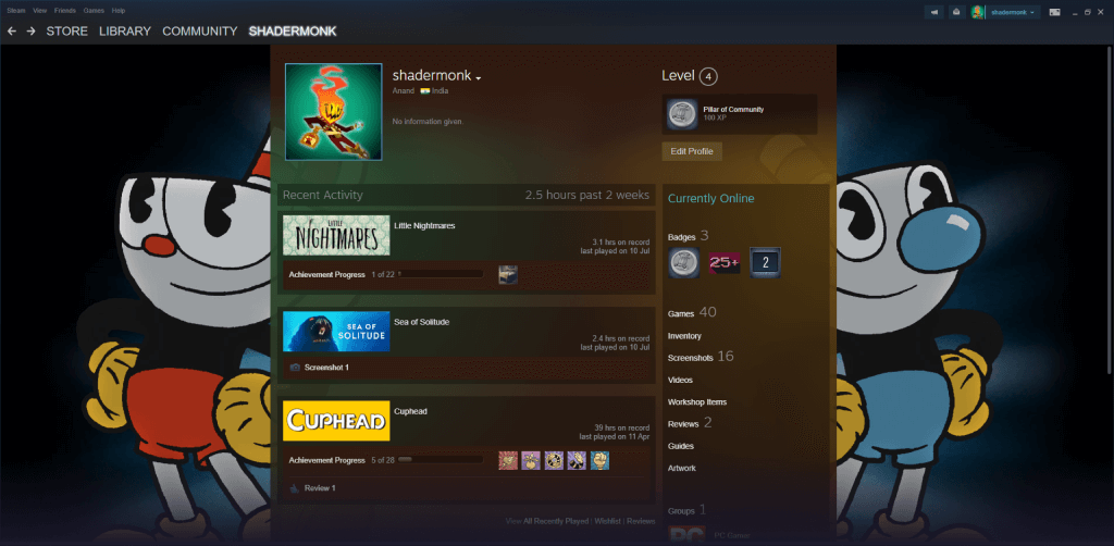
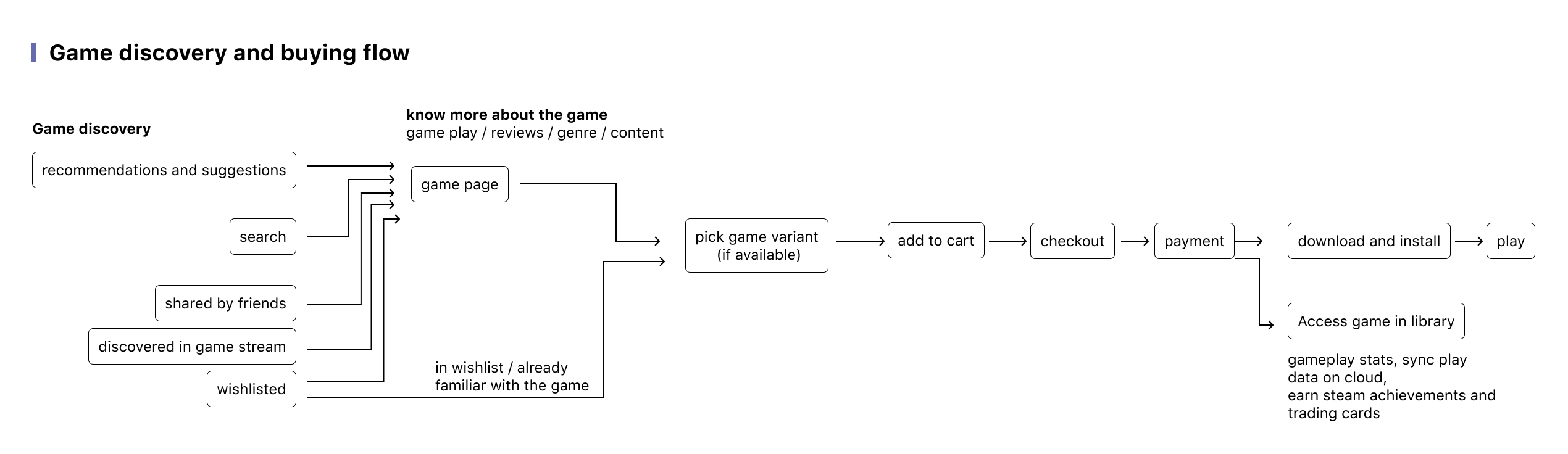
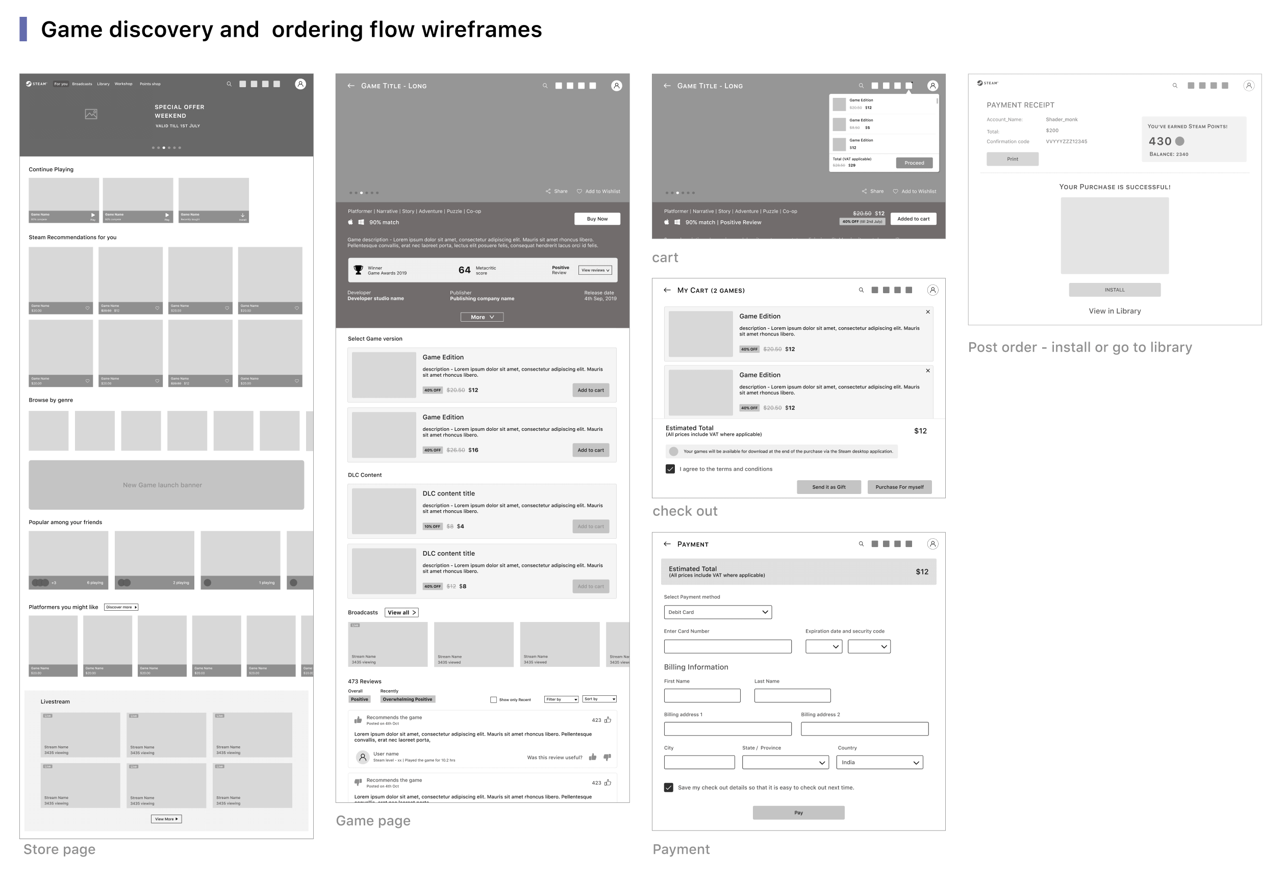
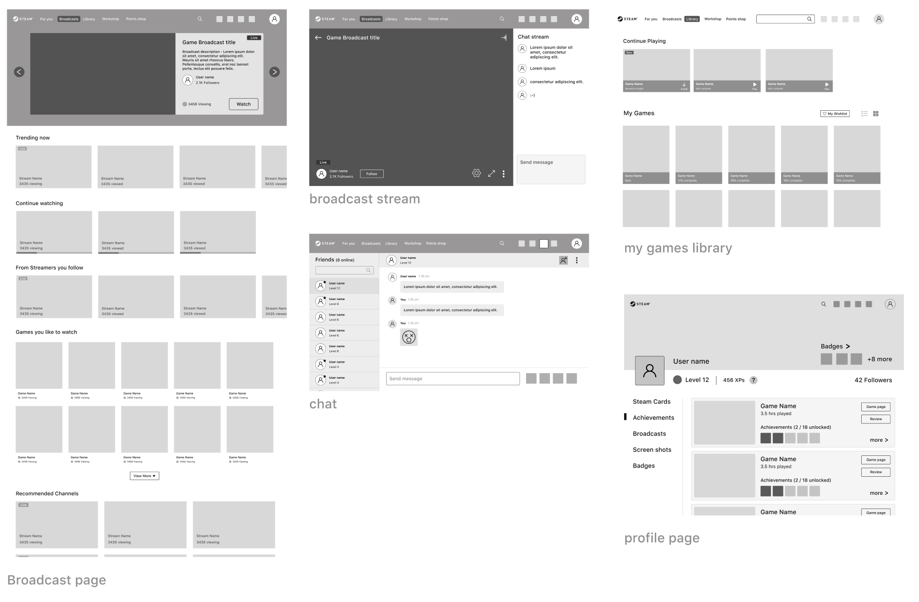
Steam is the preferred gaming platform for PC gamers (me being one of them!), a place where we can discover and access great games to play. The Steam interface is a relic of the past with its heavy UI. It recently got an UI revamp which a lot of users were looking forward to but not satisfied as they expected big interface changes. The following personal project study is to understand the steam store UX and come up with a modern revamped version of steam interface that is clutter free and showcases different capabilities of steam (not only games but its community features, livestreaming & remote co-op play, achievement systems).


Let's ask some Steam users

With an intent to know the gamers reaction to Steam UI update, I went through public forums like this reddit posts. The general reaction is steam users are happy with the interface revamp but expected more. The steam interface still looks cluttered and overwhelming. I also did interview of few steam users to understand the problems they face navigating steam.

Mathivanan, 25
VFX Artist, Steam name - Madforce
“Steam Library looks cluttered, not clear UI, What’s new in my game library is irrelevent.”

“does not feel like exploring new game content or featured list in steam unlike in Epic games”


Main tasks | Motivations
Discover new games | Play games | Game suggestions from friends.

Pain points
Cluttered UI | overwhelmed with content and game offers | completing purchased games.
Rajith, 23
Game Designer, Steam name - Shady
“My most used feature in steam is Library. Finding and launching the game I want to play could be much easier as I have to scroll though list or huge game cards.”

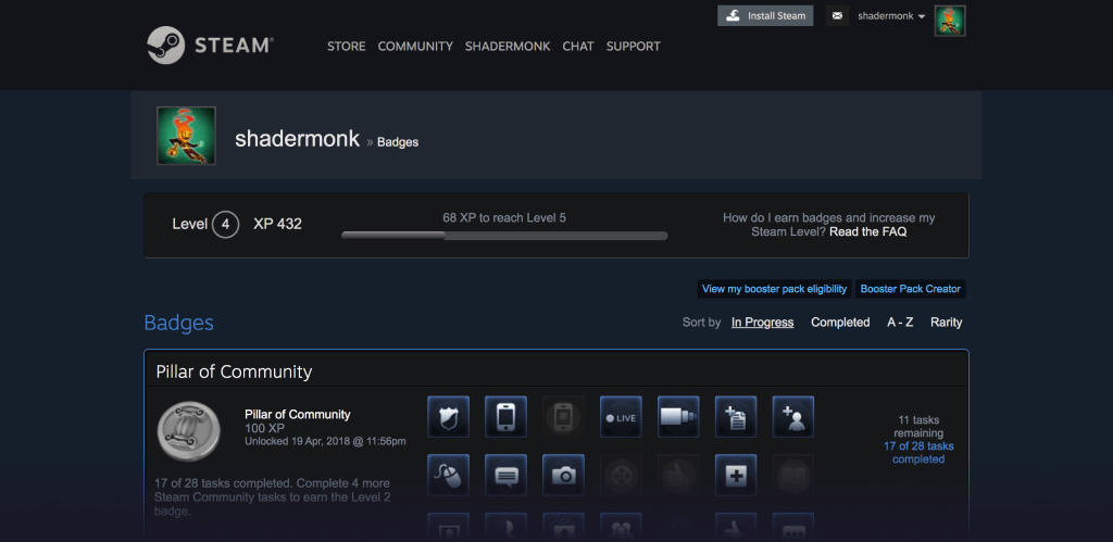
“I find the total play time and last played info handy as I find that a thing to feel proud about.”


Main tasks | Motivations
Finding a game in my library and play | Track and earn steam ahievements and cards by play.

Pain points
Difficult to find game in my library.
Rajesh, 33
Transportation Designer, Steam name - Voldermot
“I don't like the new library showing bigger cards and cannot browse through my purchase list easily. Have to scroll through a longer list.”

“Steam UI is complicated, has too many features to explore and requires a level of mastery and usage over time”


Main tasks | Motivations
Finding a game in my library and play | Need to know how good the game is before buying and spending time on playing | Track offers to buy wishlisted game.

Pain points
New game library makes it difficult to find games | Steam UI is complicated an requires mastery to dicover its other features.
Shiben, 36
Indie Game Developer, Steam name - Shibenb
“I didn’t find anything special about steam. Its just another website with carousel and categories. I fell it could be so much more, but it is not.”

"Game suggestions can be better. It still doesn’t know that I like short games. It understands the genres I like, but it doesn’t seem to understand things in depth."


Main tasks | Motivations
Discover new games to play.

Pain points
Suggestions and recommendations do not match my preference | the UI looks functional but not interesting or showcasing relevant content.

Steam UI breakdown

Let's look at the UI of steam and attempt to understand what user expereince it is offering and where there is scope for improvements. On steam app launch, an offers popup appears which if usera are interested can click next and browse or close. The user will land on landing on thestore page can check out these offers anyway and so the offer popup feels obstructive.

Store / Landing page

The steam landing page is store page where players can discover new games to buy unlike say playstation store or GoG galaxy which focuses on bought games / completions. Other features in steam like broadcasting, community, achievements take a backseat in the UI and gives just a feel of an game buying portal whereas in reality steam has more depth to it.

Current UI
- Categories, genres and tags repeated in top and side menu adding to clutter

- Different banner sizes / the price info is in smaller font size

- Use of lot of horizontal carousel adds to the friction of exploring content

- As a landing page there is mainly offers and selling as primary feature
Scope for change
- Simpler interface with less repetitive menus

- Consistent and clear banner sizes with artwork and information nudges to sell

- Game recommendations like from friend’s play list, based on play time

- Add non-selling features like friends online, continue playing, livestreaming / chat to make the landing page into a welcome home page and let the user choose the path. Also it will showcase steam features upfront.

Game store page

The game store page has lot of relevant information needed for the player before purchasing a game like game genre, gameplay video, ratings, user reviews, critic ratings, system requirements, DLCs and more.

Current UI
- Information can be condensed and primary information can be highlighted instead of the current steam UI which scatters all over the page.

- Add to cart button should not be pushed down for the player to scroll and access as it is the primary call to action in this page.
Scope for change
- Continue playing section to quickly jump into games recently played

- Games with multiplayer can highlight friends online

- Highlight game completion / progress in game card to nudge/ motivate the player to complete.

Community

Steam community has lot of features like broadcasting of gameplays, game screenshots / reviews, new updates to games. But all these are scattered around and not organised into relevant content contexually. For example, the community can show feeds / livestreams related to games I’m currently playing instead of randomnly showing unbought game. Also game news/ updates can be organised clearly into separte section.

Current UI
- Broadcasts / videos & screenshots are random and not contexual

- Accessing broadcast has lot of touchpoints and not upfront in community
Scope for change
- Can have a feed experience like twitch/ youtube for broadcast

- Have a community feed of relevant games played by the user or the games interested in.

Profile and Achievement systems

Steam has a deep Achievement system with hours of play, badges, steam trading cards, player level and points shop . The steam UI does not do justice to these multiple systems and makes it look complex for the player to understand.


Issues with the current UI

01
Cluttered and overloaded UI
02
Community features like livestream / remote play are scattered and does not have ease of use and familiarity
03
Friction in accessing relevant games to quickly play in library / increase nudge for game completes


04
Though Achievement system in steam has depth, the presentation lacks clarity and looks complex to understand
05
Livestreaming play sessions can be made more seamless and social
06
Highlight friends online for multiplayer games and remote co-ops
Job 1
When the steam users are looking for new games to play, they would like to explore and know about relevant game recommendations, so that they can purchase a game that they really like to play and complete.
Job 2
When the steam users want to watch game streams for entertainment, they would like to explore the broadcast page in steam, so that they can view a relavant game streaming that is entertaining.
Job 3
When the steam user comes to steam to continue playing the last played game or new game, they would like to quickly launch the game from the library, so that they don't spend time on other activities in the platform.

Let's start with the landing page experience which is the entry point for the user on launching the steam app in PC. The current landing experience in steam is focussed on store page that shows all the offers running in steam and recommendations for game buying conversion like an e-commerce store. Such an approach leads to lot of game purchase in steam but not good game completions by the users. The proposed solution is to treat steam more like a content platform than an e-commerce store. The landing page has a for you section that suggests the user relevant game which might result in better game completions and engagement for the user.

mobile wireframes and flows

Watching game streams are primary engagement activity for a lot of gamers (Refer verge article or this one). Steam currently has a broadcast section but it is inside community page with more friction to access it. The broadcast section can also add to better game discovery point in steam by suggesting relevant game streaming content to the user and be a platform like twitch. To drive this, the broadcast section is made one ofthe primary tab. Continue playing section in landing page is proposed to quickly launch the last played game without friction for the steam user and increasing game installs.

mobile wireframes and flows

The profile section is re-thought to better showcase the user's progression and achievements in steam. Refer this figma file for the final wireframes.


UI concept


The ordering flow


The profile page


The profile page of steam has lot of information like game achievements, trading cards, badges. The UI concept makes presenting these features without overwhelming the user and be lost in searching a particular milestone like in the current UI.


UI Prototype


A click through mock is made in figma and tested with steam users.


User testing


The figma prototype is user tested with few steam users for feedbacks in comparison with the current steam UI. Overall, the designs were well recieved by everyone. They found a huge improvement in accessibility of featurea as well as clear look of the concept over the current steam UI. They gave a few meore important features in steam like quick accessing joystick settings, big picture mode UI (for controller based navigation), game version installed information in my game page, more feature changes to profile page by adding activity logs and make remote play much more easily accessible.


Since steam has been my go to platform to play games, this side project has been a good learning for me to know more about the depth of steam platform and made me think about how I could make it much better. I’ll look back the designs for this project soon with a fresh set of eyes and add more changes taking feedbacks. Thank you all for reading!